Font-tastic
Similar to colors, font’s can make or break your design. It’s often the things that are the most subtle, that make the most impact.

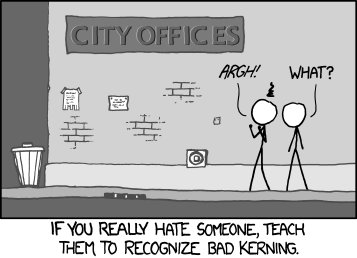
Font selection, kerning, line height, style, these are all things you definitely should be thinking about. With the wonderful invention of FontFace, you no longer are limited to the standard web fonts.
 Comic sans the whole site! Or don’t. Please don’t.
Or use this wonderful resource of “new” webfonts. Or convert one of your favorite fonts to a “webfont” with FontSquirrel (a font aggregator with great taste).
Now, I recognize I have a serious problem with fonts – similar to Pokemon, I feel, I’ve “gotta collect them all”. 52 body styles of Neutra? Bring it on! 100 different “handwriting fonts”? Why not? Fonts based purely on dingbats? Sh’yeah.
At the end of the day, though, less is more.
Build your app or website with no more than 3 fonts:
- A display font (the fun/elaborate one for titles & big things)
- A body font (basic serif or sans serif)
- And maybe a third one for variation – pull quotes, sidebars, submenus, etc (another simple complementary serif/sans to pair with the body).
After selecting the “look” of your fonts, then you can get down the nitty-gritty – the “science of fonts” if you will. This article pretty much sums up the extremes you can go to, in creating the ideal font spacing, sizing, etc. Review it, think upon it, and go forth and make beautiful typography.


